www.fgks.org   »   [go: up one dir, main page]

Editor:
Updated: Today
Topic:

Imprint

The aesthetics that defined a punk band

A Detroit group's collage-style magazines come together as a visually fascinating book

Destroy all monsters
Artbook | D.A.P.
This article originally appeared on Imprint.

via Artbook | D.A.P.

ImprintIn the summer of 2009, the venerable Printed Matter in New York City exhibited "Hungry for Death," a riot of ephemeral kitsch propaganda created by the Ann Arbor, Mich., band Destroy All Monsters. I made several visits to the show, interested in how the founding members -- Jim Shaw, Mike Kelley, Cary Loren, Niagra -- had embraced the Sun Ra band-as-lifestyle attitude (plus I was writing about the show for Grafik, which was just recently resurrected). Having never officially released an album, the band earned its reputation as instigators, playing punchy punk licks backed by droning vacuums and, between 1976 and 1979, publishing an eponymous magazine.

I could have made 100 trips to the show and I never would have been able to check out all of the bits of paper, buttons, and handbills. It did not surprise me that there was no show catalog. How would anyone organize all of this stuff? Since then, the show has toured internationally, but I don't think anyone has dared to photograph and scan the material and try to finesse it into a book.

It probably doesn't matter since Primary Information has released a facsimile edition of Destroy All Monsters magazine's six issues and an unreleased seventh issue. While the exhibit featured plenty of stuff that you can't find in the pages of the magazine, anything D.A.M. created musically or visually was an extension of these seven issues.

via Artbook | D.A.P.

Don't let the cover's refined smoke-wisp lettering issuing from the woman's cigarette fool you. The Xerox collage, cut-up advertising and hand-written scrawls fill the pages like psychedelic buckshot, a big sloppy kiss of reactionary, tongue-in-cheek lampooning of popular culture. The visuals assault you. So it should come as no surprise that the zine's fifth issue, from January 1979, included Antonin Artaud's "The Theater of Cruelty (First Manifesto)," which pleads "to recover the notion of a kind of unique language half-way between gesture and thought ... to be accomplished by a thorough involvement, a genuine enslavement of the attention."

Like the Printed Matter show, this volume demands constant and renewed attention. Phrases like "poultry economy" mingle with horror movie posters, repurposed ads and images of Sean Connery, Betty Paige, and Andy Warhol. Executed in the grungy, DIY style so popular today, the inventiveness of these visual poses and juxtapositions cannot be denied. Fusing the themes of the science-fiction fanzines popularized in the 1950s with the blotter-paper visuals of the underground comics and mail art scene of the '60s (in equal parts addled contempt and ecstasy), D.A.M magazine is the precursor to publications like Cometbus and the sort of contemporary zines featured in books like Behind the Zines.


via Primary Information

Like any good zine, Destroy All Monsters magazine sprung from the vision of a few like-minded souls. There is no direct translation or easy read of this hooligan cipher -- fluency in its frenetic language was only possible for the band. But thanks to the good people at Primary Information, readers can now pour over these pages, surrendering their attention to visual cues that even in our digital age resonate with the same distorted timbre as they did over 30 years ago.

Copyright F+W Media Inc. 2011.

Salon is proud to feature content from Imprint, the fastest-growing design community on the web. Brought to you by Print magazine, America's oldest and most trusted design voice, Imprint features some of the biggest names in the industry covering visual culture from every angle. Imprint advances and expands the design conversation, providing fresh daily content to the community (and now to salon.com!), sparking conversation, competition, criticism, and passion among its members.

Hooked on design's latest craft craze

A filmmaker talks about how he started making "paper toy monsters" and how to go about building your own

This article originally appeared on Imprint.

ImprintWho knew? Apparently making paper toy monsters is kind of a big deal to a certain small group of art and design enthusiasts. And like street art, break dancing, wrestling, or any other niche art groove, there are heroes, villains, elaborate story lines, and great names (not just of the monsters but of the designers themselves). Oh, and no small amount of nerd factor. I basically knew nothing about this -- is "movement" too strong of a word? -- but apparently like any hobby, it can be extremely addictive, so let that be a warning. I sat down with Garrison Beau Scott, aka baykiddead, a filmmaker, photographer, and now paper toy monster maker from Des Moines, Iowa, to hear more.

You recently started creating paper toy monsters with your kids as a way to kill time. Can you tell me how your hobby has grown from that?

I was introduced to the world of paper toys when my daughter and I were looking for something to do one rainy day a few years ago. I found the site for Readymech and we built three of the models, Skeletron, UK Johnny, and Tentaclopse. Then, I came across State of Shock Studios. They've done paper toy versions of Phish as well as Frank Zappa. That's when it clicked for me, and I started to search for what else was out there. One link led to five more, and then five more, and so on. Each site/designer offered up their paper toys for free. I literally stayed awake all night clicking and clicking, downloading template after template. Very addictive.

But at the time I had no ink for my printer, and couldn't justify spending $60 to make paper toys. Then I came across the wonderful book "Papertoy Monsters" from Workman Press, featuring 50 different monsters from 25 of the genre's best. The book makes it very easy to build the monsters. They're pre-printed on card stock and perforated, so it's pop-out, fold and glue. Repeat. The hard part is finding shelf space.

Soon I realized I was hopelessly hooked I was and I started to see how intertwined the community is. It was that revelation that led me to discover the practice of customizing someone else's design. The first was Nani? Bird created by Josh McKible. I submitted my custom, sailor.bird, and once I saw it posted on the site, and realized I'd made a (albeit very minor) contribution to the community, it was like adding gasoline to an already raging fire. It was only natural that the next step for me would be to design my very own toy, and that's when Fiendly the leechoso was born. Fiendly the leechoso, the first paper toy monster designed by baykiddead
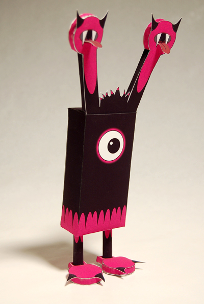
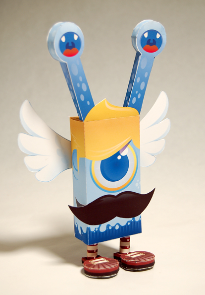
Fiendly the leechoso, the first paper toy monster designed by baykiddead

Boss Cyclops, a leechoso species of paper toy monster created by baykiddead and skinned by salazad.

Boss Cyclops, a leechoso species of paper toy monster created by baykiddead and skinned by salazad.

Doze, a leechoso species of paper toy monster created by baykiddead and skinned by abz.

Doze, a leechoso species of paper toy monster created by baykiddead and skinned by abz.

There appears to be a whole paper toy monster subculture. Can you talk about that a bit?

The subculture is one aspect I enjoy most about the art. As I said before, it's very inclusive. What stands out for me is the lack of competition. No one ever asks for anything in return, they just want to share, be it a design of their own, or a template they've collected that's disappeared.

Not every paper toy is a monster. In fact, most aren't. There's a whole bunch of sub-genres. One of the biggest is fanboy type stuff, paper versions of video game characters, anime, and cartoon characters.

Clockwise from upper left: El Ogro (by Vinyl or Die), Vini the Viking (by Dikids), Obi (by Bean Helen), Macho Mecha (by Marshall Alexander), Crazy Top (by Jennifer Rouse), Foldabot (by Marshall Alexander), Bang Bang (by Dolly Oblong).

Clockwise from upper left: El Ogro (by Vinyl or Die), Vini the Viking (by Dikids), Obi (by Bean Helen), Macho Mecha (by Marshall Alexander), Crazy Top (by Jennifer Rouse), Foldabot (by Marshall Alexander), Bang Bang (by Dolly Oblong).

How physically big are these toys? And, perhaps more pertinent, what do you DO with them? Are they primarily collectibles?

The toys range in size. The smallest in my collection measures just 1 ¾ inches and my tallest is almost a foot tall. But I've seen toys that stand over 4 feet, comprised of over 500 sheets of paper. That's another great thing about the medium, is that most of the designs are created in Illustrator as vector art and so they're scalable. As a builder, you're really only limited to the size of paper your printer can handle.

And yes, they're primarily collectible. However, there are some that have been created as desktop calendars, holiday ornaments, I have an iPhone cradle, and then there's the sub-genre of paper automata where either a crank or pendulum is incorporated into the design to allow for movement.

Chick Magnet, skinned by baykiddead, from the "Calling all Cars" series, designed horrorwood.

Chick Magnet, skinned by baykiddead, from the "Calling all Cars" series, designed by  horrorwood.

Whose paper toys do you most admire?

I have an emotional attachment to Fwis, who is responsible for the Readymech series. And then there's Shin Tanaka, the first designer that blew my mind with what he can do with a simple sheet of paper. Besides Shin, my favorites would have to be Matt Hawkins, Marshall Alexander, Dolly Oblong, Horrorwood, Guillain Le Vilain, Harlancore, salazad, Abz, Nick Knite, Marko Zubak, [MCK], Mckibillo, 3 eyedbear, Thunderpanda, Tougui, Cubeecraft, and PHIL. And that's just in the interest of space.

How much does a paper toy monster go for?

There are designers who've charged for their toys, but for the most part, they're free. I've paid for a few, but they really have to be special, or used as a fundraiser for an important cause. There are some who design toys for clients, usually with an advertising or illustrative angle. One of the more impressive examples I've seen was a newspaper robot featuring Rupert Murdoch  Matt Hawkins did for Newsweek.

But really, I don't think anyone does it for the money.

Left to right: Hoophy (skinned by KOA, designed by Shin Tanaka), Freddie: Rodrigo del Papel (skinned by Dolly Oblong, designed by Tougui), Folksy (by Papertoys.ru), Boxcan (skinned ny Yebomaycu, designed by PHIL), Black Frost in the Box (by Harlancore)

Left to right: Hoophy (skinned by KOA, designed by Shin Tanaka), Freddie: Rodrigo del Papel (skinned by Dolly Oblong, designed by Tougui), Folksy (by Papertoys.ru), Boxcan (skinned ny Yebomaycu, designed by PHIL), Black Frost in the Box (by Harlancore)

What does your daughter think of your new hobby now and does she still work with you?

Both my daughter and son have been bitten by the bug. They each have their own copy of "Papertoy Monsters" and it's fun to watch their collections grow. Every morning my son asks if I've made any new ones. If I say yes he hightails it to the studio to check them out. They know most of the designers just by looking at the toy. For my daughter's birthday, we threw her a paper monster-themed party where for one activity, all her friends were able to customize a template. They both have also designed their own toys, and it's awesome to watch the creative and analytical process take over. To be able to share this with them stokes me out beyond words.

My Daughter's Keeper, inspired by baykiddead's daugher Emmy

My Daughter's Keeper, inspired by baykiddead's daughter Emmy

What kind of paper do you use? What other materials do you need to create these?

The paper I use is a heavyweight matte paper; I like the way the surface takes the folds. You definitely want a thick card stock for structural integrity, but not too thick as some of the folds can get bulky. The basic tools (besides an Internet connection and printer) that I use are an X-Acto knife, straight edge, scissors, and glue stick. That's all you really need. But my process has evolved to include two other knives, a self-healing cutting mat, my library card, tweezers and a long thin paintbrush handle. I use one of the knives to score the folds, and the library card to make sure the fold is as crisp as possible. The other knife is used to apply the glue into a tight spot and the paintbrush handle and tweezers are used to get into the small places where my fingers won't fit.

How durable are they?

Durability can be an issue, it's paper and glue. As I'm discovering, heat and humidity aren't really kind to finished models, and living in Des Moines ... but the first three toys I made a few years ago are still standing, though a bit faded. I've resigned myself to the reality that most, if not all, will have to be re-made at some point.

How long does it take to make one of these monsters?

The time commitment can be a few minutes to a few hours, as far as the toys I've made. But the collector that built the 4-foot-tall Optimus Prime spent six months on it. I really enjoy starting something and finishing it in one sitting. It's the perfect union of my type-A desire to be as perfect as I can and my impatient side that wants to see it done and in my collection.

Shaman, a recycled template designed by baykiddead

Shaman, a recycled template designed by baykiddead

Shaman Voodoo

Shaman Voodoo

Where do you get your ideas?

When I decided to make the jump from collector to designer, I was fortunate to come across a posting on a great resource for the paper toy community. The site is called Nice Paper Toys and one member posed an at-large question, "How do you go about designing your toys?"

The two invaluable pieces of advice that came back were: Think of a toy you want but doesn't exist yet. Then make that toy. And the other was, always be on the lookout for inspiration, you never know where or when it'll strike.

I carry around a sketchbook now and use the camera in my phone to snap pictures of things I see that I'd like to incorporate into a design.

How long will you pursue the craft?

I'll stop when I no longer feel the three joys I associate with paper toys. There's a great satisfaction of the final touch, finished and sitting in your hand. The transformation from blank paper to piece of art is complete. And then there's the moment of placing it into the collection, sitting back taking it all in and the way it changes the whole. But the real joy is discovering a new template and the anticipation of building it. As long as I can fold, cut, glue, and get excited by form, I'll do it.

Copyright F+W Media Inc. 2011.

Salon is proud to feature content from Imprint, the fastest-growing design community on the web. Brought to you by Print magazine, America's oldest and most trusted design voice, Imprint features some of the biggest names in the industry covering visual culture from every angle. Imprint advances and expands the design conversation, providing fresh daily content to the community (and now to salon.com!), sparking conversation, competition, criticism, and passion among its members.

Shaping how the future will look

The work of a self-taught structural designer envisions sustainable, energy-efficient cities

This article originally appeared on Imprint.

ImprintFar from being a futurist, I'm often the last to know. For instance, I hadn't known about Jacques Fresco (here) until recently stumbling across the 2006 film "Future by Design" by William Gazecki (get DVD here; trailer here and here), a documentary about Fresco's life and output. His work is a revelation and fascination; it stems from Bucky Fuller's futurism and seems to have influenced many contemporary architectural projects. But see for yourself.

Anyone who loves vintage World's Fair futurism, as I do, Utopian conceptualizing and optimistic urban planning will enjoy Fresco's work and outlook.

He is a self-educated structural designer, industrial designer, philosopher of science, concept artist, educator, and futurist, with focus on philosophy, science, and engineering. Fresco's mission has been, notes his Wiki, "the holistic design of sustainable cities, energy efficiency, natural resource management, cybernated technology, advanced automation, and the role of science in society, focusing on the benefits he claims this will bring." With Roxanne Meadows, he is the founder and director of an organization known as the Venus Project. (See clips of interviews here and here on designing ocean cities.)

If nothing else, watch his 1976 interview with a very young Larry King.

Copyright F+W Media Inc. 2011.

Salon is proud to feature content from Imprint, the fastest-growing design community on the web. Brought to you by Print magazine, America's oldest and most trusted design voice, Imprint features some of the biggest names in the industry covering visual culture from every angle. Imprint advances and expands the design conversation, providing fresh daily content to the community (and now to salon.com!), sparking conversation, competition, criticism, and passion among its members.

Finding inspiration in rainbows

From Brazilian murals to London's Rainbow House, we look at eye-catching designs that celebrate the color spectrum Video

Favela painting project
A painting project by Haas & Hahn
This article originally appeared on Imprint.

ImprintI recently had a client who was going to let me have a "free for all" with rainbows in her boutique. It is not often someone trusts a crazy artist to have a color freak-out, imagine my delight! Unfortunately they backed out, but not before I had done a ton of research for inspiration so now you get to reap the benefits.

I had been thinking of doing something like this in the ceiling. Most likely it will end up in my house, or stay in my mind until I live in a castle.

Mexican artist Gabriel Dawe creates huge three-dimensional art installations using Gütermann thread.

Paying tribute to the rich and colorful art of his country, Mexican artist Gabriel Dawe creates huge three-dimensional art installations using Gütermann thread. Carefully connecting different colors together, he weaves multiple threads onto wooden frames creating a semi-transparent geometric rainbow. For more about Gabriel, check out his website at www.gabrieldawe.com.

Mexican artist Gabriel Dawe creates huge three-dimensional art installations using Gütermann thread.

One of many painting projects by Haas & Hahn

Haas & Hahn is the working title of artistic duo Jeroen Koolhaas and Dre Urhahn. They started working together in 2005, when they filmed a documentary about hip-hop in the favelas of Rio de Janeiro and São Paulo for MTV. Inspired by this visit, they embarked on a journey to bring outrageous works of art to unexpected places, starting with painting enormous murals in the slums of Brazil together with the local youth.

The initial idea of the Favela Painting project has always been to paint an entire hillside favela in the center of Rio, visible to all inhabitants and visitors.

As the Portuguese translation for "the hill," o morro is also used as a synonym for slum or favela; we chose to use this name for the third stage of the Favela Painting project.

Haas & Hahn

Retro Futurism by Sakke Soini

This piece (above) inspired the first round of logos I did for Light Rail Studios. I did the website too, might as well check it! The logo has since evolved into something else but man am I a sucker for anything sci fi looking or sounding.

Light Rail poster

First poster for Light Rail Studios 2011 by Antlre Creative Inc.

Sarah from www.littlebunny.net sent me this image of a rainbow spiral staircase, which I quickly went berserk with and was thrilled at my findings.

Staircase in The Rainbow House - by Ab Rodgers (London)

Ab Rogers Design -- in collaboration with DA.Studio -- created the Rainbow House, a living piece of art. This funhouse-meets-home is situated on a busy street, so when you enter it offers a magical escape from the hustle of reality.

Highlights include a rotating circular bed in the master bedroom, centralized rainbow spiral staircase spotlighted by a skylight, trap door to a slide that brings you down into the living room, and an oversized 26" x 40" piazza living area.

Watch the video!


Colorful stripes by Gene Davis.

Lastly I will leave you with the outfit I have been wearing to write this entry on this killer sunny day in San Francisco.

Hannah Sitzer

Hannah Sitzer's daily outfit planner June 14th, 2011

Copyright F+W Media Inc. 2011.

Salon is proud to feature content from Imprint, the fastest-growing design community on the web. Brought to you by Print magazine, America's oldest and most trusted design voice, Imprint features some of the biggest names in the industry covering visual culture from every angle. Imprint advances and expands the design conversation, providing fresh daily content to the community (and now to salon.com!), sparking conversation, competition, criticism, and passion among its members.

One nation's love affair with matchbooks

A look at how Japanese graphic artists mixed cultural aesthetics when designing these ubiquitous products

This article originally appeared on Imprint.

ImprintCollecting matchbox labels is called phillumeny; its obsessive proponents are phillumenists. One reason there are so many phillumenists is because there are untold matchbox (and matchbook) graphics that can be found in virtually all corners of the globe.

Among the industry leaders Japan was exceptionally prodigious, and the designs produced were various, plentiful, and consistent with the early 20th-century expansion of the nation's heavy industries. Commercial art played an important role, in general, as it developed brand recognition and sales for new industrial products. It put Japanese graphic designers at the forefront of what is now called "branding." The designers were seriously influenced by imported European styles such as Victorian and Art Nouveau, which is evident on these matchboxes (and later by Art Deco and the Bauhaus, introduced through Japanese graphic arts trade magazines, and incorporated into the design of matchbox labels during the late 1920s and '30s).

Western graphic mannerisms were harmoniously combined with traditional Japanese styles and geometries from the Meiji period (1868-1912), exemplified by both their simple and complex ornamental compositions. Since matches were a big export industry, and the Japanese dominated the markets in the United States, Australia, England, France, and even India, matchbox design exhibited a hybrid typography that wed Western and Japanese styles into an intricate mélange. The domestic brands, however, were routinely designed in a more reductive -- though typically Japanese -- manner solely using Kanji characters.

In Japan, matchboxes were a mainstay of daily, vernacular culture. Safety matches became important staples in part because they satisfied a primal social need (fire), and because of the nation's substantial lumber industry that supplied a near endless supply of material. The largest Japanese match manufacturers, including Shungen & Co., Mitsui & Co., Seiryukwan, and Koyoukan Binnaka Seizo, from Osaka, Koshi, and Himeji, were all well known, but the artists who created their respective designs were purposely kept in the shadows -- like most commercial artisans in other quotidian fields. Anonymity was the fate of those who produced the most vibrant, as well as the most ephemeral, products of the Japanese popular arts. Nonetheless certain manufacturers were known for certain styles designed to appeal to different aesthetic tastes. Nisshinsha's labels often featured a central "trade mark" (a rabbit suggesting good luck) or a vignette (two-winged cherubs framing a globe), while Shiyosegumi Seizo's labels were heavily typographic with tiny images integrated into the overall design.

But for the most part, the labels followed a standard template that was developed in the late 19th century and was maintained for decades.

(These matchbox labels come from a petite rice paper album c. 1905.)

Japanese Matchbox Labels

Japanese Matchbox Labels

Japanese Matchbox Labels

Japanese Matchbox Labels

Japanese Matchbox Labels

Japanese Matchbox Labels


Copyright F+W Media Inc. 2011.

Salon is proud to feature content from Imprint, the fastest-growing design community on the web. Brought to you by Print magazine, America's oldest and most trusted design voice, Imprint features some of the biggest names in the industry covering visual culture from every angle. Imprint advances and expands the design conversation, providing fresh daily content to the community (and now to salon.com!), sparking conversation, competition, criticism, and passion among its members.

Why designers need a mix of clients

Leaning too heavily on a single customer puts you at risk. Here's how diversifying will help your business

This article originally appeared on Imprint.

Always try to diversify your client base...

ImprintNo single client should account for more than 25 percent of a studio's business. When it happens -- and it will! -- immediately draw up a list of new potential clients to call.

Here's a brief personal story that explains why.

In the late '90s, I worked at a design studio that had a major telecommunications client. More than 50 percent of our monthly billings were derived from creating logos and names for new product launches, helping to brainstorm print ads and direct mailers, and otherwise serving as a creative sounding board. There was no retainer agreement, only new projects that were opened with a rough time estimate and hourly rate.

It was creative nirvana. You could spend as little or as much time as you wanted on a project, as long as you had a range of thinking in your comps. Our clients trusted us, and we trusted them.

My wife and I had been discussing moving to Seattle for some time, and the final decision to make the move was difficult -- mainly because this firm was such a great place to work. But I gave my notice, my wife and I packed up our place and hopped in our car for a month-long cross-country jaunt. One morning in Chicago, while lolling at my sister-in-law's kitchen table eating some oatmeal, I saw in the newspaper that my client's company had misstated earnings across all of their financial statements and were going to declare Chapter 11 bankruptcy. The project work from that client would bleed away from my former employer.

So, it's easy to be optimistic about what you can control in your designer/client relationship. You can inform them and provide insight. You can educate them regarding their options, both strategic and tactical. You can even be Chief Design Officer and sit at the big polished mahogany table powering up your big presentation on how you'll optimize their customer experience and rethink their brand and make amazing new products that will bring in billions. You can make your direct design clients happy, and show success with every project that you do. But you can't fully control their business decisions beyond what you design, or volatile business conditions that may lead to their demise.

This is why you need to diversify the mix of clients that you choose to work with. Diversification helps to reduce the level of vulnerability you take on from your client accounts as a business owner. Would you put all of your money in one outperforming stock, assuming that in two or three years it will continue to increase in value? As the legally mandated disclaimer says on any investment vehicle: Past performance is no guarantee of future results.

Here's a few reasons why diversification will be critical for your design business:

Diversification will allow you to sustain the loss of a client while protecting your studio overhead.

If you hire a dozen people to service a client that provides a high percentage of your revenue, when that client dematerializes, so do all those jobs. (This can be common practice at large agencies that seek retainer relationships.) This is a weak business model for a small firm and can't be sustained without risking the collapse of the entire business.

Diversification protects you from cash-flow fluctuations due to client policies in accounts payable.

If you aren't asking for payment upfront for each design phase, and instead offering credit and Net 15/30/45 billing, you may have lived through this problem with your largest clients. If a client needs to choke down on their accounts payable, it's your credit on the line, and asking for interest on the late payment won't make up for your scramble to assess the impact to your business's cash-flow.

Diversification protects you from being in a poor negotiating position due to being beholden to one benefactor.

When a client knows that you are dependent on their business, it can cause price negotiations that risk diluting the agency's profit margin. Every agency I've worked at that had a lopsided client portfolio has suffered at one point due to this.

Diversifying your client base will make for a more compelling portfolio.

The benefit of a diverse portfolio is that it demonstrates your curiosity, your range of skills in various domains of design, and the desirability of your services. If you want to be the designer whose portfolio contains work samples from only one business type or industry category, go right ahead. But chances are there are only so many similar clients you'll be able to find.

Even when you become frighteningly busy due to the work on your plate, continue to call prospective clients and new business leads. Continue your networking. If you close down and focus all your attention on making your sole client happy, in the short term you may profit -- but your risk of harming your business in the long term will only increase.

Then again, it's only when the rug is pulled out from under you that you can gain a new perspective ... when you're lying on the floor.

Copyright F+W Media Inc. 2011.

Salon is proud to feature content from Imprint, the fastest-growing design community on the web. Brought to you by Print magazine, America's oldest and most trusted design voice, Imprint features some of the biggest names in the industry covering visual culture from every angle. Imprint advances and expands the design conversation, providing fresh daily content to the community (and now to salon.com!), sparking conversation, competition, criticism, and passion among its members.

Page 1 of 9 in Imprint Earliest ⇒

About Imprint

Salon is proud to feature content from Imprint, the fastest-growing design community on the web. Brought to you by Print magazine, America's oldest and most trusted design voice, Imprint features some of the biggest names in the industry covering visual culture from every angle. Imprint advances and expands the design conversation, providing fresh daily content to the community (and now to salon.com!), sparking conversation, competition, criticism, and passion among its members.

Imprint in the news

Loading...

Currently in Salon

Other News

 
www.salon.com - sacdcweb01.salon.com Quantcast